Pass Data Between Python and R using Parquet & Arrow for Scalable Reporting
By
F
François MichonneauAuthor(s):
F
François MichonneauPublished: July 27, 2023
10 min read
We believe that standards drive freedom — like the freedom to choose the programming language that best fits your need. This is why we support the development of open source tools that give you the flexibility of choosing where your data is stored and how you work with it. This freedom makes you more productive and allows you to optimize your costs.
To demonstrate this idea, we’re showing how to use Parquet and Arrow to pass data from Python to R. We will do this in the context of writing a report in R using data stored in Snowflake. R provides a rich and robust ecosystem of tools to generate reports and their visualizations. However, there is not yet an out-of-the-box solution that allows you to query data stored in Snowflake from R especially if you want to use dplyr’s expressive syntax1. On the other hand, Ibis offers an intuitive and expressive Python API to connect to Snowflake as one of the 18+ backends it supports.
The exchange of data from Python to R could take place directly on your hard drive, but there might be workflows (e.g., the data extraction from Snowflake runs as a CRON job and is used in other contexts or for auditing and reproducibility purposes) where it might be preferable to have the exchange happen on a cloud storage solution like AWS S3 or Google Cloud Storage. Arrow makes it easy to write and read data from these filesystems, and we show how to do this in this post.
We will work with the PUMS dataset that we already have available in Snowflake. The report we want to generate from it includes maps that show the proportion of households for which the energy costs (electricity and gas) exceeds 30% of their income in the South Atlantic states (Florida, Georgia, South Carolina, North Carolina, Virginia, West Virginia, DC, Maryland, and Delaware). We will focus on generating static versions of these maps, but a similar approach could be used to generate a Quarto document, a Shiny app, or a dashboard.
Step 1: Extract the relevant data from Snowflake
To get the data from Snowflake, we start by declaring our dependencies:
python
import os
from ibis.interactive import *
from pyarrow import fs
import pyarrow.parquet as pq
We use the os module to get the environment variables needed to pass the credentials to connect to Snowflake. We will use Ibis to query Snowflake, and PyArrow to save the data to our S3 bucket. Using from ibis.interactive import * is a shortcut to import what is needed for interactive use of Ibis including the selectors we will use below.
Next, we are going to connect to Snowflake and get the table that contains the data of interest for our report:
python
con = ibis.snowflake.connect(
    user=os.environ.get("SNOWFLAKE_USER"),
    password=os.environ.get("SNOWFLAKE_PASSWORD"),
    account=os.environ.get("SNOWFLAKE_ACCOUNT"),
    database=os.environ.get("SNOWFLAKE_DATABASE"),
    warehouse=os.environ.get("SNOWFLAKE_WAREHOUSE")
)

(h21 := con.table("2021_5year_household")
sql
┏━━━━━━━━┳━━━━━━━━━━━━━━━┳━━━━━━━━━━┳━━━━━━━━┳━━━━━━━━┳━━━━━━━━━┳━━━━━━━━━┳━━━┓
┃ RT     ┃ SERIALNO      ┃ DIVISION ┃ PUMA   ┃ REGION ┃ ADJHSG  ┃ ADJINC  ┃ … ┃
┡━━━━━━━━╇━━━━━━━━━━━━━━━╇━━━━━━━━━━╇━━━━━━━━╇━━━━━━━━╇━━━━━━━━━╇━━━━━━━━━╇━━━┩
│ string │ string        │ int64    │ string │ int64  │ int64   │ int64   │ … │
├────────┼───────────────┼──────────┼────────┼────────┼─────────┼─────────┼───┤
│ H      │ 2017001437749 │        7 │ 02900  │      3 │ 1105263 │ 1117630 │ … │
│ H      │ 2017001437758 │        7 │ 05912  │      3 │ 1105263 │ 1117630 │ … │
│ H      │ 2017001437777 │        7 │ 05905  │      3 │ 1105263 │ 1117630 │ … │
│ H      │ 2017001437805 │        7 │ 05911  │      3 │ 1105263 │ 1117630 │ … │
│ H      │ 2017001437806 │        7 │ 05907  │      3 │ 1105263 │ 1117630 │ … │
│ H      │ 2017001437816 │        7 │ 03304  │      3 │ 1105263 │ 1117630 │ … │
│ H      │ 2017001437842 │        7 │ 04636  │      3 │ 1105263 │ 1117630 │ … │
│ H      │ 2017001437869 │        7 │ 02311  │      3 │ 1105263 │ 1117630 │ … │
│ H      │ 2017001437882 │        7 │ 02513  │      3 │ 1105263 │ 1117630 │ … │
│ H      │ 2017001437888 │        7 │ 05905  │      3 │ 1105263 │ 1117630 │ … │
│ …      │ …             │        … │ …      │      … │       … │       … │ … │
└────────┴───────────────┴──────────┴────────┴────────┴─────────┴─────────┴───┘
We are now ready to subset this data to select the rows and columns we need for our report:
python
energy_data = (
    h21
	 .filter((
        (_.DIVISION == 5) & (_.TYPEHUGQ == 1)
    ))
    .select(
        _.ST,
        _.PUMA,
        _.HINCP,
        s.startswith("ELE"),
        s.startswith("GAS"),
        _.ADJHSG,
        _.ADJINC
    )
)
The filter() operation will keep only the rows for the South Atlantic states (Division 5 in the PUMS dataset) and only the housing units (TYPEHUGQ variable set to 1). The select() operation keeps the columns we need: the state (ST), the Public Use Microdata Area code (PUMA) which divides states into areas where the population is 100,000 people or more, the household income (HINCP), and the adjustment variables (ADJHSGand ADJINC) to transform income and energy costs into constant dollars. We select the columns related to energy costs with the selector s.startswith(). The costs of both the electricity and the gas are in two columns: one is a flag to inform how to interpret the value found in the other. As its name implies, the startswith() method allows you to select columns that start with a given string.
If you are familiar with the tidyverse in R, Ibis’s syntax should not be too disconcerting. The verbs used to wrangle the data, like filter() and select() are common between the two. Ibis’s selectors like s.startswith() allow you to perform many of the same operations as the tidyselect package. There are some differences in the way to specify the predicates in filter() or the way to choose the columns within select() because of differences between how R and Python are interpreted. To help you learn these differences, there is a useful “Ibis for dplyr users” guide on the Ibis website.
Step 2: Write our dataset to AWS S3
Now that we have subsetted the data we need for our report, we can save it to pass it on to R. We save the dataset in the Parquet format to an AWS S3 bucket. We use the Python implementation of Arrow, PyArrow, to do so. Here, we use a small dataset, but the same approach could be used on a much larger one.
Parquet is a column-oriented data storage format that can be used with Python and R, but also with other languages including Rust, Go, C++, Java, and more. Parquet uses efficient encoding and compression that make it a performant file format to store data. Additionally, Parquet preserves data types which alleviates parsing issues that can be found when using text-based formats like CSV files.
First, we need to specify the credentials to connect to the S3 bucket. For instance, if you use an access and secret key to connect to your AWS account, you can use the following template but the S3FileSystem() method allows for additional parameters to customize how you authenticate to your AWS account.
python
s3 = fs.S3FileSystem(
    region = "<your AWS region>",
    access_key = "<your AWS access key>",
    secret_key = "<your AWS secret key>",
    session_token = "<your AWS session token>"
)
The final step is to use pyarrow_batches() to write the data to its bucket destination:
python
pq.write_to_dataset(
    energy_data.to_pyarrow_batches(),
    "<your bucket name>/<your folder to hold the result>",
    filesystem=s3
)
You can check that the transfer was successful by listing the files included in the destination bucket with:
python
s3.get_file_info(fs.FileSelector('<your bucket name>/<your folder to hold the result>'))
We are now ready to use R to read the Parquet file from the S3 bucket and generate the report.
Step 3: Get data from AWS S3 to R with the arrow package
The arrow R package makes it easy to retrieve datasets directly from an AWS S3 bucket. If the data is not in a publicly available bucket, you can specify the authentication parameters using the s3_bucket() function. You can then pass the object returned by this function to open_dataset() to access the data:
r
library(arrow)

energy_s3 <- s3_bucket(
  "<your bucket name>/<your folder to hold the result>",
  region = "<your AWS region>",
  access_key = Sys.getenv("AWS_ACCESS_KEY_ID"),
  secret_key = Sys.getenv("AWS_SECRET_ACCESS_KEY"),
  session_token = Sys.getenv("AWS_SESSION_TOKEN")
)

energy <- open_dataset(energy_s3)
Step 4: Final data preparation
To prepare the maps, we need to wrangle the PUMS data to generate the statistics we need.
To simplify this example, we will only include households with a positive annual income (HINCP > 0) and remove households with no data included in the annual income column. We will convert the income and the energy prices for gas and electricity to constant dollars using the variables provided in the PUMS dataset. We need to convert the ST column to character as it is how the values are stored in a table we will use later for a join. Finally, the costs for gas and electricity are provided on a monthly basis while the income is provided as the annual amount. We adjust this difference to calculate the energy cost for each source as a ratio to the annual income.
r
library(dplyr)

se_energy <- energy |>
  filter(!is.na(HINCP) & HINCP > 0) |>
  mutate(
    adj_income = HINCP * ADJINC / 1e6,
    adj_electricity = ELEP * ADJHSG / 1e6,
    adj_gas = GASP * ADJHSG / 1e6,
    electricity_income_ratio = adj_electricity / (adj_income/12),
    gas_income_ratio = adj_gas / (adj_income/12),
    ST = as.character(ST)
  ) |>
  select(
    ST,
    PUMA,
    starts_with("adj_"),
    ends_with("_ratio"),
    ends_with("FP")
  )
If you try to inspect the data at this point, you will notice that R won’t display a data frame but instead some arrow-specific information. It’s because data wrangling operations in the arrow package are deferred and we haven’t called collect() to pull the results into R’s memory. We will do that next.
Let’s start by aggregating the data and generating two datasets: one for the electricity costs and one for the gas costs. To help with this, we are going to write a short function to calculate the mean ratio aggregated by state and PUMA codes and bring the result in R’s memory:
r
calc_ratio_energy <- function(.data, var, ratio = 0.3) {
  .data |>
    group_by(ST, PUMA) |>
    summarize(
      p_above_ratio = mean( > ratio)
    ) |>
    collect()
}
We can now use this function to create the two datasets:
r
electricity_ratio <- se_energy  |>
  filter(ELEFP == 3) |>
  calc_ratio_energy(electricity_income_ratio)

gas_ratio <-  se_energy |>
  filter(GASFP == 4) |>
  calc_ratio_energy(gas_income_ratio)
We filter on the ELEFP and the GASFP columns, as 3 and 4are flags which respectively indicate whether the value in the ELEP and GASP columns are valid.
These data frames are now available, and here is what the electricity_ratio data looks like:
r
> electricity_ratio
# A tibble: 455 × 3
# Groups:   ST [9]
   ST    PUMA  p_above_ratio
   <chr> <chr>      <dbl>
 1 37    00400    0.0333
 2 37    03102    0.0320
 3 37    02600    0.0284
 4 37    01201    0.0192
 5 37    01600    0.0219
 6 37    02000    0.0254
 7 37    03104    0.00765
 8 37    04400    0.0258
 9 37    03500    0.0245
10 37    05100    0.0589
# … with 445 more rows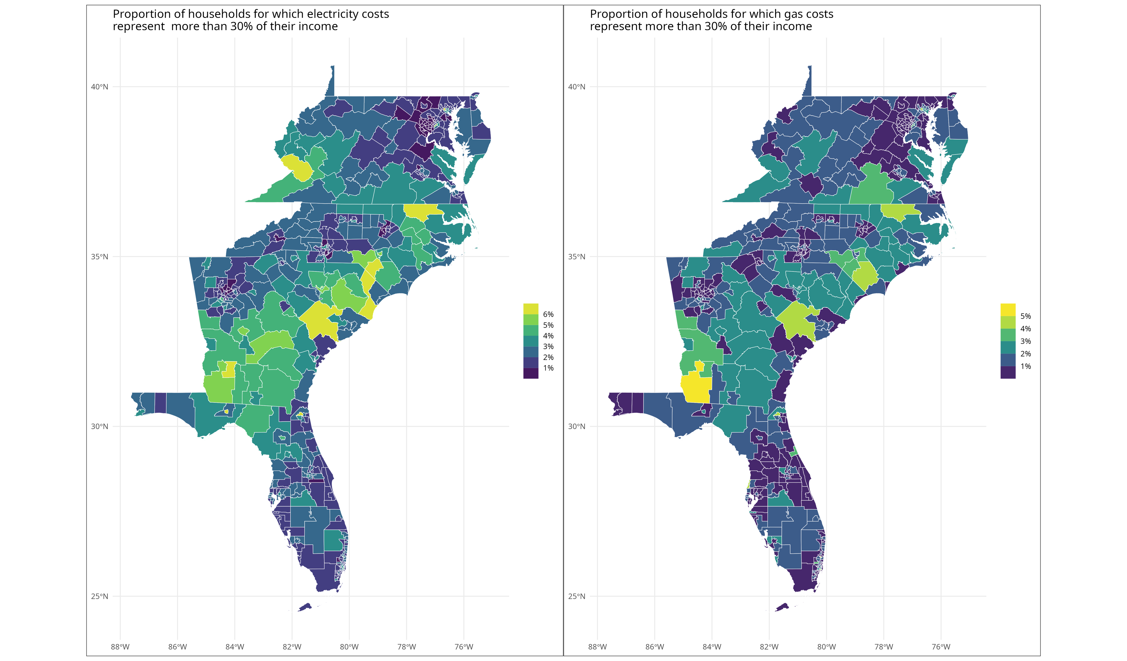
Step 5: Generate the maps
Let’s now create the maps from these data frames. The tigris package makes it easy to create maps from US census data by providing — among many other datasets — the shapes for the PUMAs. We can then join this data with our summary aggregates to generate the map. We will again create a helper function to create a map for the electricity and gas costs. The patchwork package makes it easy to place the two maps side-by-side.
r
library(tigris)
library(ggplot2)
library(purrr)
library(patchwork)
options(tigris_use_cache = TRUE)

## Get the PUMAs data for the South-East Atlantic states
se_atl_states <- c("FL", "GA", "SC", "NC","VA","WV","DC","MD","DE")
se_atl_pumas <- map_dfr(
  se_atl_states, tigris::pumas, class = "sf", cb = TRUE, year = 2019
)

## Function to generate the chloropleth map of the energy costs
plot_energy_ratio <- function(d) {
  se_atl_pumas  |>
    left_join(d, by = c("STATEFP10" = "ST", "PUMACE10" = "PUMA"))  |>
    ggplot(aes(fill = p_above_30)) +
    geom_sf(size = 0.2, color="white") +
    scale_fill_viridis_b(
      name = NULL,
      n.breaks = 7,
      labels = scales::label_percent()
    ) +
    theme_minimal() +
    theme(
      plot.background = element_rect(color = "#333333")
    )
}

plot_electricity <- plot_energy_ratio(electricity_ratio) +
  labs(
    title = "Proportion of households for which electricity costs\nrepresent more than 30% of their income"
  )
plot_gas <- plot_energy_ratio(gas_ratio) +
  labs(
    title = "Proportion of households for which gas costs\nrepresent more than 30% of their income"
  )
plot_electricity + plot_gas
Conclusion
Arrow and Parquet bring you the flexibility to work in your language of choice to leverage their respective strengths.
When working with enterprise-scale data, you need subsets of the data to create dashboards or reports. The tools you use for your data preparation might not be the same as the ones you use for your reporting, but relying on open source tools and standards makes it easy to move data around. Arrow and Parquet bring you the flexibility to work in your language of choice to leverage their respective strengths. As we demonstrate here, we use Python with Ibis to connect to our data cloud (Snowflake) and R to generate maps that could be included in a report.
Voltron Data helps enterprises embrace open source standards for their analytical workflows. If you are interested, learn how Voltron Data can help.
Resources to go further
- Guide on the Ibis website: Ibis for dplyr users
- Code used in this post on GitHub
- With the recent release of the ADBC driver support for Snowflake, this is getting much easier. The blog post announcing this new feature includes the code to use dplyr syntax with a Snowflake backend powered by the ADBC driver. We will explore this topic in a future post. ↩
Previous Article

Keep up with us